Last day was spent fixing the colouring and masking out random noise. As I had left it to the last minute, the titles are very simple. I think it looks nice for the first few seconds coz you feel all moody and ominous, then it cuts to Jacque and music box and it completely throws me off. No time for anything more sophisticated however, so I guess it will have to serve to foreshadow his grim, grim end.
If I had to review my animation at this stage:
-aforementioned conflict with titles
-jarring and disorientating beginning
-laughs are a bit unconvincingly cut together, but otherwise alright flow for rest of scene 1-(oh and at the part where he jumps off the bed weird I added a blink in and it made such a difference)
-scene 2 feels good
-music good
-wut, random card
-not sure what to think of the solitary random card
-the director's idea of subliminal messaging?
-more like the director's miserable attempt to tie things together even when the absence of certain elements renders the effort absolutely meaningless
-anyway, still good up until they sit at the window
-there some animation needing redoing
-lighting is nice
-music not ideal, but not bad
-something happened now it looks like a climax
-music does not work to be honest
-no feel
-and yaaay it's over!
More evaluation:
I think the main problem with Slapjack as a whole is that it was built upon a retrospectively poor foundation. The story was weak to begin with, and would have worked better as a more stylised animation, but there was minimal work done for look and feel.
Some things to remember for future projects, KEEP IT SIMPLE STUPID. Like, actually simple. And do a lot of concept art and style frames. Since that's what I'm into.
I probably reiterate, but I think the best place for this work is online. Aside from the potential for a huge audience, there's that psychological aspect for me; online all of your work can be viewed together, whilst at a festival or something it's that one work representing you. It is something you have done, versus something you have DONE. And it really is too weak for DONE.
^Excuses
Anyway, I will be submitting this to festivals (bullied), but as the main place for it is online/showreel, again, online hand in tomorrow.
DONE!
Thursday 25 October 2012
Wednesday 24 October 2012
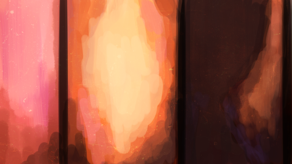
Glow abuse
Which level of glowiness?
Why, the level that most effectively masks the dodginess painfully apparent in a high resolution render.
Why, the level that most effectively masks the dodginess painfully apparent in a high resolution render.
 |
| low res, high res + small glow, high res + more glow |
Background assimilation
Michelle's backgrounds:

.PNG)

I think I underestimated how difficult it would be to copy somebody else's style. Nevertheless, they were a massive help, and I managed to assimilate two of them with a quick blending & rendering job, plus some random texture/adjustment layers.


I am a bit irked by the bedpost colour on the first one, but I haven't had time to fix it, so hopefully I am the only one who notices.
Animation Festivals
Since After Effects is freezing up every five minutes (I should really learn to pre-render), I might as well take this time to update my log. I have been bullied into submitting my work to animation festivals, so here are some of them that I would be ok submitting to, I guess.
-2D or Not 2D Animation Festival
-Blue Mountains Film Festival
-Melbourne International Animation Festival
-miscellaneous free ones
Actually the only one I really personally wanted to submit to was the 2D or Not 2D one, because it was started by Tony White, whose books were an amazing resource for me trying to learn to animate traditionally. But I was searching for it a few weeks ago and found not much recent information about it. I'm keeping my fingers crossed that it hasn't died, but it is looking likely that it has. Grumble. I was also kind of interested in GRAPHIC, at the Opera House, but considering the due date is on Sunday, I wouldn't be able to polish it nearly enough by then, and anyway, looking at the calibre of previous animations done for GRAPHIC, it's kinda a lost cause.
The other two are because I prefer nearby locations I can get to, and they seem cool. Other than that, I am probably just going to go down the list of animation festivals with free submissions on that website I found, and just send it off randomly. I know I should prioritise the big/semi-big festivals, substandard quality or not, so I won't put it up publicly online too soon, on the off chance I catch myself in an optimistic mood. So for hand in, I think I will put it up on Vimeo, but on private, so it's sort of like, it will be public, but not yet... yeah.
Sunday 21 October 2012
Error 16
Today, Adobe CS6:
Please uninstall and reinstall the product.
If this problem still occurs, please contact Adobe technical support for help, and mention the error code shown at the bottom of this screen.
Error: 16
And the hilarious thing is, After Effects CS6 files are not backwards compatible with After Effects CS5.5, which is the version installed on the beasts at COFA.
Yet another manifestation of Murphy's Law.
Friday 19 October 2012
Shadows
For dodgy, inaccurate, but passable shadows in After Effects:
-duplicate colour layer
-skew
-rotate
-scale
-fill
-ramp
-gaussian blur
For when animated masks just doesn't cut it.
-duplicate colour layer
-skew
-rotate
-scale
-fill
-ramp
-gaussian blur
For when animated masks just doesn't cut it.
Thursday 18 October 2012
8 days to go
No time for anything, quick update, backgrounds done, colouring 99% done, cards 90% done, leaves done, music is passably alright, foley 20% done (!!!!), shadows, blankets animation, titles/credits NOT done, and I'm giving up on animating the falling cards, so there is a single transition type falling card randomly and THAT'S IT. I mean it's not necessary to the story but it woulda helped, I reckon. Sad, sad life.
Colouring list:
So I win! ...yeah.
Backgrounds:
Michelle:
-2.02
-3.05
-3.06
-4.02
Except the backgrounds are still quite different to my style. I have assimilated 3.05 and 3.06 but I haven't time to do 2.02 before assessment.
What else... note about the cards I guess, thought I was gonna do them in AE but found it was neater and less computer intensive to warp them directly onto the frames in PS.
The leaves I did today, a bit of an issue with AE not being able to import my multiple video layers and smart objects but I put each leaf in a separate file and that worked out.
And man! The colouring in some areas is horrendous. Mostly my fault coz I told people quantity over quality, but I cringe.
Final (thereabouts) look:

Gonna add a glow thing to it on Susan's suggestion and coz it do look nice.
Finally got around to zooming in the cards sequence and it's good after all.
Shadows takes longer than expected. Gah.
No other progress shots today, too busy progressing.
And I'll post up a list of festivals and stuff soon, just after I finish this... ok that's not soon.
Photoshop tip of the day:
Hold down R for one second to temporarily activate rotate canvas tool.
Colouring list:
Me:
-1.02
-1.08
-1.10
-1.11
-1.12
-1.13
-2.04
-3.06
-3.12
-3.18
-3.20
-3.21
-1.02
-1.08
-1.10
-1.11
-1.12
-1.13
-2.04
-3.06
-3.12
-3.18
-3.20
-3.21
Pauline:
-1.03
-1.05
-3.05
-3.08
-3.10
-3.11
-3.13
-3.14
-3.15
-3.16
-1.03
-1.05
-3.05
-3.08
-3.10
-3.11
-3.13
-3.14
-3.15
-3.16
Kimmy:
-1.06
-3.02
-3.03
-3.09
-1/2
-1.06
-3.02
-3.03
-3.09
-1/2
Nancy:
-2.01
-2.03
-3.01
-3.19
-2.01
-2.03
-3.01
-3.19
Juliana:
-1.04
-1.04
Andrew:
-2.02
-2.02
So I win! ...yeah.
Backgrounds:
Michelle:
-2.02
-3.05
-3.06
-4.02
Except the backgrounds are still quite different to my style. I have assimilated 3.05 and 3.06 but I haven't time to do 2.02 before assessment.
What else... note about the cards I guess, thought I was gonna do them in AE but found it was neater and less computer intensive to warp them directly onto the frames in PS.
The leaves I did today, a bit of an issue with AE not being able to import my multiple video layers and smart objects but I put each leaf in a separate file and that worked out.
And man! The colouring in some areas is horrendous. Mostly my fault coz I told people quantity over quality, but I cringe.
Final (thereabouts) look:
Gonna add a glow thing to it on Susan's suggestion and coz it do look nice.
Finally got around to zooming in the cards sequence and it's good after all.
Shadows takes longer than expected. Gah.
No other progress shots today, too busy progressing.
And I'll post up a list of festivals and stuff soon, just after I finish this... ok that's not soon.
Photoshop tip of the day:
Hold down R for one second to temporarily activate rotate canvas tool.
Tuesday 2 October 2012
Timing
The best way for timing out frames for me was in After Effects I found. Originally I was going to do it in Photoshop, but since most of my colouring people didn't use Timeline anyway, and also a host of other issues with After Effects not interpreting the layers right that I can't remember right now, After Effects was the way to go.
The files had to be really clean first however. I separated each shot into two separate files, colour and line. I got rid of any groups, and made sure each layer was on max opacity; it screws with you later otherwise.
Also important was to get rid of any Timeline information remaining on the Photoshop files. I couldn't figure out a nice way to just turn it off so I had to first switch it to Frames and then back to Timeline, so that all the layers would be active at once, then duplicate it to a new file. Frames puts everything on zero opacity though so had to remember to max that.
Or you could just duplicate twice. Whatever floats your boat.
So that way I get clean, consistent layers to work with in After Effects. You know, there is probably a way to clean up stuff in AE anyway, but I couldn't find any, so it was just neater to have everything there on import.
On working in AE, I gotta remember to do this:
- Set durations of pre-comps
- Set pre-comps to 25fps
- [ or ] --> Move In point or Out point of selected layers to current time
- Alt+[ or Alt+] --> Trim In point or Out point of selected layers to current time
Plus if you want to preserve the blending mode effects (like the transparency from Multiply) in a pre-comp, collapse transformations. I don't know why that works, but it do.
Tuesday 18 September 2012
Character animation complete
I think this is 9 weeks behind my original schedule.
Nevertheless, it is something to be glad about.
Upcoming: scanning, colouring, backgrounds, shadows, cards & leaves & blanket animation, foley, in order of priority.
Yes, I am terrible.
Nevertheless, it is something to be glad about.
Upcoming: scanning, colouring, backgrounds, shadows, cards & leaves & blanket animation, foley, in order of priority.
Yes, I am terrible.
Monday 10 September 2012
Animating the laugh
As the only piece in my animation that I was syncing to audio, animating the laugh posed a couple of new challenges I guess. I had a rough idea in my mind of viewing the audio as a waveform and writing down the timings of bits, and then maybe roughly testing out the timing of some keyposes, but which software? Doing it directly in Photoshop was my first preference, but although you could bring in audio, there was no way to view the waveforms, so it lacked the precision I was after. Next I tried Premiere Pro and Flash. Premiere was irksome, and I never liked it anyway, so I gave up on that. Flash would have been ok, except the recording was a bit on the quiet side, and so the waveforms were invisible. There seemed to be a limited way of resizing the timeline, plus I couldn't get the audio to play, so I ditched that and went to Audition, which was the logical first choice, come to think of it. So I ended up using Audition to find the exact time I wanted, then timing it out in Photoshop.
I had only a faint idea of how laughs really went, taking them all for granted as it were, so Youtube came into handy there. Although most of the footage tagged with my search terms were of babies, I could see that, contrary to prior assumption, the mouth did not really change shape with each syllable, and head bobbing was minor. I chose to accentuate the head and shoulder movement (exaggeration, booyah), and moreover recalled the use of a figure 8 motion path for the animation of a laugh in one of them books I read; most likely the Animator's Survival Kit. I haven't consciously done that figure 8 thing yet so I thought it'd be good to give it a try.
I had only a faint idea of how laughs really went, taking them all for granted as it were, so Youtube came into handy there. Although most of the footage tagged with my search terms were of babies, I could see that, contrary to prior assumption, the mouth did not really change shape with each syllable, and head bobbing was minor. I chose to accentuate the head and shoulder movement (exaggeration, booyah), and moreover recalled the use of a figure 8 motion path for the animation of a laugh in one of them books I read; most likely the Animator's Survival Kit. I haven't consciously done that figure 8 thing yet so I thought it'd be good to give it a try.
Now I just need to get all this information down on paper. Which will take ages. Which I might not even get done this week because I have another assignment due. Which sucks because I am SO CLOSE to finishing all the character animation for this thing.
2 MORE SHOTS!
Sunday 9 September 2012
Laugh
The sound component is coming along, if not amazingly. Music is the most done, with Nick coming in to work on it every week, foley I am still putting off as much as possible. Good news however, is I have laughs! Susan kindly organised for me to record her son who is about the right age (and ridiculously adorable to boot). It took me a while to whittle down and mix and match the audio (which mostly consisted of us trying to make him laugh) to a reasonably believable continuous laugh sequence. It didn't help that he had this (ridiculously adorable) sarcastic laugh going most of the time which was short and I could only use the beginning of. Short laughs have a different quality to long laughs I found.
Thursday 30 August 2012
Halfway
Week 7 is halfway right? Except for some reason I'm currently at the min point of my panic sine curve.
This is what halfway currently looks like:
This is what halfway currently looks like:
Tuesday 28 August 2012
Revised schedule

Ok, I kid.
But it's looking pretty bad nevertheless, and I think I'm gonna need that extra week 13. I'm going to try really hard to get all the animation finished up next week in the break, and with the backgrounds and other odds and end, that'll leave hopefully 2, 3 weeks for putting it together and chucking in as many production-quality-booster type stuff (shadows, gradients, blurs, moving holds etc.) as I have time for.

Sunday 19 August 2012

Tuesday 14 August 2012
Sound design commence
I've been neglecting the audio element lately, so last week I re-learnt myself some Pro Tools and started processing the music fragments Nick has composed for me. I am only using midi, because I don't know anything about good sound recording, and anyway there's so many sounds to choose from it's awesome. I managed to get the beginning down alright, I think (besides it sounding like some horror film).
Original:
With stuff added:
Nick didn't have the luxury of being able to directly match up music to animation though, so the rest of it is going to be difficult to make cohesive.
Colour Script v2
So I figured when the sun sets there's this colour change happening, plus some dimming. The old one was more stylistically inclined, but I figured I had such vibrant oranges for the window I might as well stay consistent to that.

After Effects
This was a while back, but I thought I should write about it. You know how I said I thought After Effects was a waste of time (not really)? Well I still do (not really), except a little less now. This is probably obvious to most people, but me being a relative AE noob, I thought it was real nifty when Susan showed me how to use pre-comps!
I love pre-comps!
They're this thing where instead of having one composition where you just Shove Everything In, you have a composition referencing multiple compositions referencing multiple compositions etc. in a tree-like structure. Things start looking half organised even.
You go from something like this:


Notice the size of the scroll bar. Anyway, so what could happen is that I have a pre-comp for each shot, and pre-comps in that composition for each layer and pre-comps in that one for outlines and colours and time out all the frames for a single shot in single composition. As I said, a huge obvious major AE feature that I managed to miss, but still, I'm learning! :D
After Effects still not amazingly convenient for me though, because I my computer isn't tank enough for reasonably fast previews, and file management is annoying as always.
I love pre-comps!
They're this thing where instead of having one composition where you just Shove Everything In, you have a composition referencing multiple compositions referencing multiple compositions etc. in a tree-like structure. Things start looking half organised even.
You go from something like this:

To something like this:

Notice the size of the scroll bar. Anyway, so what could happen is that I have a pre-comp for each shot, and pre-comps in that composition for each layer and pre-comps in that one for outlines and colours and time out all the frames for a single shot in single composition. As I said, a huge obvious major AE feature that I managed to miss, but still, I'm learning! :D
After Effects still not amazingly convenient for me though, because I my computer isn't tank enough for reasonably fast previews, and file management is annoying as always.
Thursday 2 August 2012
Wednesday 1 August 2012
On industry and employment
Edit: stress removed.
Apparently I'm meant to be giving some thought to my future in this course. Well, I'm not actually graduating yet, but I have been thinking about it a lot recently.
We were asked to define our industry. Like, specifically. Well I dunno. Is that a "what do I want to be when I grow up" question? If I had to go into specifics, well, the list includes character animator for film, 2D and/or 3D, game/film concept artist, book illustrator. Doing indie films and taking the funding and festival route is very appealing, but, you know, I need to buy my parents a house and everything, so something that pays a little better is a priority. I've also always wanted to make my own picture book and do comic strips in newspapers, but that's a different story.
And how is Professional Portfolio (this animation) going to help me? To be honest, I don't think it will, in itself. Besides the fact that it's a 2D hand drawn animation of the type that I don't think there's any jobs around Sydney for (correct me if I'm wrong), I also gave up on drawing concept art for it, so I have nothing to show in that area.
Overall though, the main issue is that the quality is nowhere near "professional". My animation doesn't work -mainly coz I'm a bad director. I would feel uncomfortable trying to promote it as a work. The only direct good that can come of it is that I have some traditional animation to buffer my animation showreel, which only consists of 18 seconds of 3D animation due to lack of practice/everything else being below standard.
I've been following this super long thread on DLF lately, mainly featuring a great deal of Aussie unemployment in the CG area. The way the debate has been leaning, the problem seems to be the high Aussie dollar, and thus outsourcing digital labour to cheaper Asian countries. There's veterans in the field saying they can't find a job.
Now that's really daunting for the student, naturally. But the way I see it, sure it is probably a lot harder to find work nowadays, however, I do believe there's always a market for quality. So in terms of Packaging vs. Content, quality content wins it for me. Speaking personally again though, I can't even do the whole selling your product business. They tell you not to undersell yourself, but I lack in the self esteem department (yes I am completely aware). I accept that, only it means that, for me, content is everything. It has to be outstanding. It's outstanding or nothing.
I'm not too concerned that my work is not going to be outstanding. I have an extra year after all, to build up a volume of work. I think I will focus on 3D and still image though, to better my job prospects. And then an honours year if I can't find work or if I manage to get a scholarship or something.
Also, a while back I attended a SIGGRAPH talk by Andrew Silke. Now he was really, really cool (he created the Generi rig!) and everything he said was super inspiring, but there was one thing that really stuck. He showed us this video, which basically sums up where I'm at:
Sunday 22 July 2012
Updated animatic
Well, semester has started again, so I guess it's time for another update on going ons. I haven't really been updating my animatic since I started animating, since I am doing it on paper, and have barely any time anyway, so I thought I'd do it when I start scanning stuff in. But according to Susan I should be constantly updating it, in order to see how the shots fit together. Which I totally get, but I didn't think I'd have time, considering Aftereffects, timing, rendering... well she said she would show me a quick way, so we'll see. I mass updated it this week anyway, just to see my progress:


It's depressing.
I tell myself that I haven't yet put in the slapping bits near the end I animated but couldn't be bothered timing, and a section in the middle that I did in Flash, but that's still nowhere near halfway.
Good news though, is I have a couple of helpers for colouring the animation. The need for newer versions of Photoshop made it difficult for some, but I am lucky, I have some very nice friends. :) I might also be enlisting external help for backgrounds as well. I have completed a few already, but not enough. My friend Michelle is super talented, and I have asked her if she could do a couple of the bigger backgrounds I haven't the time for. She is yet to confirm though. She has a blog here: http://meshellfish.tumblr.com/
Some of my backgrounds:
 |
| I have changed the style of the backgrounds to a smoother look. This was faster for me, using gradients for lighting instead of hand painting it. |
 |
| Much neater style, compared to my previous look for this. |


Which reminds me, I have to source some playing card designs. No way am I designing 52 cards... but the court cards I might have to do, to have them look similar to my Jacque/Death design. Gah.
On the sound front, Nick is currently inputting his ideas into Musescore. His new piece... I don't quite feel it fits either, but the midi in Musescore isn't that good... or maybe nothing will ever please me. Either way, it would be unfair of me to ask for another, so we are just going to work this piece vigorously. I am disappointed that Adobe Audition doesn't have midi support though, since I have it at home and it would thus be more convenient than Pro Tools. Quite a let down really.
In other news, I am ineligible to showcase my animation in the COFA Annual, as I am not a final year student. It makes sense now that I think about it, and I don't mind really, since that means I have time to develop something that is actually any good for next year. It's all part of the learning journey.
Tuesday 10 July 2012
Scanning and colouring
Method:
Max the opacity.
Manually colour in with the Brush (b) any bits missed.
- Open up Photoshop.
- Scan in all frames of the animation.
- Copy and paste everything into one file as layers (bottom to top numbering).
- Rotate, crop etc.
- Open Timeline (or Animation) panel.
- Time out animation according to dope sheet.
- Chuck on Levels and Black & White adjustment layers.
- Group all layers.
- Set group to Multiply.
- Fix up ugly bits in lines.
Colouring instructions (for my colourists):
 |
| For my dear colourists, the outline you receive should already be cleaned up to something like this with aforementioned Levels and Black & White layers. |
- Fix up any holes in the lines (black, approx 3px, 99% hard).
 For Step 1, what I mean by holes...
... and how you fix them.
- Create new layer beneath outline layers.
- Trim to same length as corresponding outline layer in the Timeline. (<= just ignore this if you don't have Timeline)
- Magic wand (w) to select background (outline layer). Try to get as close to the line as possible by adjusting the tolerance value. The bits leftover use Shift + Select. The reason for this is because the adjustment layers for the outlines don't affect the outline layers themselves, which you are making the selection on. And those layers are messy.
- Select inverse.
- Fill (g) black to create a silhouette (colour layer). This is to compensate for the scratchy pencil outline. Random black pixels look better than white ones.
- Lower opacity so that the lines are visible again (colour layer).
- Magic wand (w) same colour areas (outline layer).
- Fill (g) with corresponding colour (colour layer).
- Repeat from 8 until all areas are coloured.
- Max the opacity.
- Manually colour in with the Brush (b) any bits missed.
- Repeat from 2 until all frames are coloured.

 |

 |
| Example of how the colour layers are meant to end up; the outline layers are the top half, the colour layers at the bottom match their corresponding outline. |
 |
| For those without Timeline, this is the basic layer structure you're aiming for. |
Notes:
- Make sure you are on the correct layer.
- Just because the marker cursor thing is showing a certain layer on the Timeline doesn't mean the layer is actually selected.
- New layers start where the marker is on the Timeline.
- Useful shortcuts:
- Magic wand => w
- Brush => b
- Fill => g
- Eyedropper => hold Alt while on Fill or Brush
- New layer => Ctrl + Shift + n
- Brush size => [ and ]
- Trim to end of marker thing (I set this one myself) => Ctrl + Alt + d
Colouring instructions (pseudo-code version):
while (curr < numFrames+1) {
if (holes in curr) {
Fix up holes in the lines (black, approx 3px, 99% hard).
}
curr = next frame
}
while (frames != coloured) {
Create new layer beneath outline layers.
Trim to same length as corresponding outline layer in the Timeline.
Magic wand (w) to select background (outline layer).
Select inverse.
Fill (g) black to create a silhouette (colour layer). #This is to compensate for the scratchy pencil outline.
Trim to same length as corresponding outline layer in the Timeline.
Magic wand (w) to select background (outline layer).
Select inverse.
Fill (g) black to create a silhouette (colour layer). #This is to compensate for the scratchy pencil outline.
#Random black pixels look better than white ones.
Lower opacity so that the lines are visible again (colour layer).
Lower opacity so that the lines are visible again (colour layer).
while (frame != coloured) {
Magic wand (w) same colour areas (outline layer).
Fill (g) with corresponding colour (colour layer).
Magic wand (w) same colour areas (outline layer).
Fill (g) with corresponding colour (colour layer).
}
Max the opacity.
Manually colour in with the Brush (b) any bits missed.
curr = next frame
}
Sunday 1 July 2012
The problem with not having your own room
People keep stepping on your pegbars. Which keep breaking.
Digital animation
Hello, I have officially spent an entire week on a single shot and I feel like jumping into a very deep hole at the moment. So right now I am jumping into a very deep hole investigating ways to animate digitally, as I figured I could get away with it for the fast shots where the kids are small in frame, as they would zip by too fast to need much detailing or accurate in-betweening (my main issue with the digital method) and I could do faster timing. Hopefully.
So I've been doing some experimenting. I would want to be drawing in Photoshop by preference, naturally, but the timing is terrible. I remembered reading somewhere about having After Effects open and using both at the same time, but Aftereffects does not seem to pick up new layers added after import. And After Effects does my head in anyway. A favourite artist/animator of mine (http://qinni.tumblr.com/) recommends timing in Flipbook first, except I don't really want to buy more software even though it looks like a cool program.
Then I came across this: http://joshuakahan.wordpress.com/2011/09/25/flash-to-photoshop-importing-flash-animations-into-photoshop/
It looks promising, as I have had a little experience with Flash and the timing is GREAT. Now I just have to relearn it...
... and, aside from a couple of d'oh speed bumps (not setting stage dimensions before work), Flash is working out very well. I have the key poses of a running shot very roughly sketched out in Flash, then exported to a PNG sequence which can then be imported as a Video Layer into Photoshop. I wouldn't do this for a slow, zoomed in shot however, as I am not precise enough with my Bamboo tablet.
In other news, I give up on inking. I have done three shots so far, and although comparatively speaking it doesn't take too long (I reckon I could probably fit 5 shots into a day's work if I tried) I am unimpressed by the wobbly, ever straying line I keep producing. Sooo... I would like to just apply some Levels adjustment to my pencil drawings and hope for the best... man, if I decided this earlier I would have made the lines cleaner/darker! As it stands, I probably won't be able to do a clean paint bucket fill for colouring... bleh.
Tuesday 26 June 2012
Process
I'm gonna go a little into the... process, of sorts, that I have sort of developed whilst animating. Note that this differs for a lot of shots depending on complexity and botheredness and the number of attempted shortcuts, but you'll get the gist.
- Thumbnails. This includes anticipation and follow through poses. The times I didn't do them (really short shots, simple movements, that sod) I generally left out anticipation etc. and told myself it'd be quick enough that it would look alright. It generally didn't. (On that topic, do anticipation and follow through poses count as keyposes? I didn't know how to categorise them so I've been circling them as keyposes, but then every second number ends up circled so that the entire system feels redundant.) Oh yeah and line of action. It's a good reference sheet for that when you get caught up in the details on the real thing.
- Roughing out keyposes. I do this in blue. Man, I totally take back what I said about the col-erase before; you get used to them and they are indispensable. I can do such clean drawings in HB now... anyway, this is so you can quickly see if the action works when you do the...
- Pencil test. Usually I hate doing the whole, take photos of everything and check movement,wash, rinse, repeat- as essential as it is- and try to minimalise number of repeats, but I found that doing one at this stage saves a lot of bother down the track. Unless you do this part digitally, but I prefer not to, as then I can draw directly over my ruffs instead of copying them or whatever. I use this stage to work out my preliminary...
- Timing. Or doping. I tried doing that first but I got it wrong more often that way, so this is my order of things. I also tried using dope sheets, but I guess my unwillingness to waste more paper and ink than I do already has me just drawing keycharts all over my thumbnailing sheet instead. They don't really go into such silly details in the books. Anyway, I still get my timing wrong lots doing this though; it's like when you animate in stepped and have to massively change the timing when you change to spline in 3D. The feel is just really different, it is so hard to tell. But since there is less freedom to adjust in 2D, I try to reuse similar timings that have worked in other shots. Otherwise, it's very arbitrary. Here is the rough pencil test of one of my better shots.
- Clean-up keyposes. They tell you to clean up at the end in the books, but that doesn't address the issue of how I do accurate in-betweens in that case, so either I read the books wrong or... well, this is my way.
- Breakdowns/In-betweens. Depending on how secure or time threatened I feel, I would then go about filling everything in, with maybe some pencil tests interleaved. Mostly without, because I am time pressed. I would prefer to draw too many in-betweens and cut them out than draw too little and have to repeatedly boot up my laptop to test it. Anyway, eventually I get to some barely passable stage and that's a completed shot. This one here is mostly complete, except for the ending.
I reckon if I actually followed this foolproof master plan I could probably churn out some half decent animation. But, reality. And I find that I get a lot of shots that simply don't work; in that case the best thing to do is start over. But, rush job.
I am trying not to think about the inking.
^One of my crappier attempts, this one went through quite a few iterations. And I still hate it.
Thursday 21 June 2012
Animating in winter
Certain difficulties arise from animating in winter, which may or may not be me-specific.
Circumstances require me to adopt a distinctly un-OHS position when working.
 |
| (pseudo scientific diagram) |
Other circumstances require me to breathe.

Unpleasantness results.

Solution:

Sunday 17 June 2012
Consistency
Consistency is a very important aspect of animation, I find. There's character consistency of course, and that's what a character reference sheet is for. Otherwise, they'll probably start evolving. My reference is a little dodgy, like everything else I do, and I draw basically a morph of the dude on the sheet and my maquette, which was based off an earlier model, smart kid I am. Not ideal, but it's alright.
Then there's the animation itself. I think that's an area I am being too lax in. There's many different styles of animating: fast, sharp, light and bouncy, slow and smooth etc. Being a virtual beginner in this area, I am not too aware of the differences, and how to employ them; my main concern is believability, at my level. And I would assume that being a team of one would make that less cause for concern. But style clash, if it happened, would not be pretty, for next to how they look, a great defining characteristic of a character is how they move.
Which brings me to my third point. For our film and animation projects we are taught to create character bibles which define a character's world, their needs, desires, motivations. And in pre-production mode, I thought all of it was obvious, right there at the back of my head when I needed it. But in pre-production mode, that's all you think about, right, you're developing the story, so you basically are living in the character's minds. In production mode, your mind is on other things:
Which brings me to my third point. For our film and animation projects we are taught to create character bibles which define a character's world, their needs, desires, motivations. And in pre-production mode, I thought all of it was obvious, right there at the back of my head when I needed it. But in pre-production mode, that's all you think about, right, you're developing the story, so you basically are living in the character's minds. In production mode, your mind is on other things:
- timing
- gesture
- anatomy
- drawing to model
- anticipation
- follow-through
- overlap
- squash and stretch
- catching up to where you're meant to be on your schedule
So on and so forth. What is easy to forget, however, is that all that is informed by the character as an entity in a story, or as an individual who is alive. Everything is for a reason. There must be thought behind the action, as we were told in my 3D character animation class. And, excellent student I am, I have not looked at my bibles since I handed them in for marking.
Thoughts of a hypocritical amateur.
Thursday 14 June 2012
Colour script
Forced myself to finish the colour script this week:

I tried to get a gradual progression in the lighting, but gave up halfway. It wasn't worth it; it was better that each shot looks at least fine itself, if that makes sense. That meant I ended up with the first half doused in yellow light, and the second half in purple for some reason, but it's not as bad as I first imagined. But I might have mentioned this earlier, but I found that lighting conditions look wrong unless the characters are themselves correctly shaded, fitting them into their environment. As I don't really want to shade my boys, I'm hoping faux shading with a gradient layer over the top will be enough to convince. I should of course try this out, but... later.
Some shots did look much better in black, white and red, but the shots that look better with colour look that much better that I think colour is decided.
In other news, I am behind 6 shots in animation, the ones I have done look crap and I haven't done any backgrounds or inking at all. This is looking promising.
Wednesday 6 June 2012
Observation
Animating a small, slow movement:
2D = 1-2 hours
3D = 30 seconds
Sometimes I wish I had condensed my story a little more so I would be able to fit in those couple of hours.
2D = 1-2 hours
3D = 30 seconds
Sometimes I wish I had condensed my story a little more so I would be able to fit in those couple of hours.
Tuesday 5 June 2012
Animation commence
Week 1 of break, and I am pleased to say I am finally getting into animating, after half a week of bludge. It is going ridiculously slowly however, what with booting up the computer every time I need to test the timing (and getting ridiculously distracted every time I am online). For my second shot (yes I am only on my second shot), I tried using my new col-erase pencils for ruffs. Everywhere I looked, animators seemed to swear by them, so I thought it'd be neat to get a set. Unfortunately, I found them hard to get used to. It is probably because mine were light blue, but the lines are so faint they practically disappear with a light underneath them, and the lead is hard enough that if I tried to make it darker the paper gets massively indented and ruined. Confused, I googled the pencils again, and found that it is the lightness that makes them desirable for scanning and photocopying, and the hardness for the lack of smudging. Fair enough. So I decided to only use them for the extra broad, messy guidelines, then tighten up with a normal HB. It would involve erasing after inking, but I guess that can't be helped, and there would be less to erase anyhow.
On a side note, I have requested a new melody and working over for the music as I have decided that it is simply not working.
I don't know, I think it was because I really liked the melody, that I managed to convince myself that it was working. But I think it is probably better for my cause to just admit it early that I need something better suited. Of course it wasn't helping that all he had was a piano... so I found this nice piece of free software he could compose on:
http://musescore.org/
Plus, I have a potential laughing child; I have managed to get my cousin's son to agree to record his mother's sister's 4 yr old daughter for me, although I am not sure how the quality will turn out. Nevertheless, it is better than nothing.
Thursday 24 May 2012
Logbook dump cont.
Installment 2 of onlineification of logbook.
21/4/12
Been working mostly on revamping the storyboard this week. I’m basically redrawing everything with layers in PS so that it serves as a layout, and with more specific poses. I haven’t gotten very far, because I was trying out a different shading style with a couple of them (killing 4 birds with one stone).


Also because I suck at perspective, I have been using a basic model of the room in Maya as a perspective reference. So I chuck all my cameras in there and wala! Camera map. Anyway, these two are basically the same set up, except the bottom one has an arbitrary paint texture chucked over it. I like the look, but I wonder if it isn’t too dirty for a hospital (still no one gets the hospital/sick boy bit). The top one is actually quite aesthetically pleasing, and my sister suggested I just leave it black, white and red, which is tempting, I admit, since I was having so many problems with colour. But it is so cliché!
Something I will have to consider for that though, is the outside/window shots. They won’t work in black and white. Or, I could have very desaturated colour instead, so that there isn’t so much jarring.

^paint texture chucked on it.
I have a composer now! My friend, Nick Kazantzis, who is very skilled and talented. His main instrument is piano, but he can work outside of that with the right program, so I will introduce him to Pro Tools. He also suggested a vocal overlay of children singing, which made me very happy because that is what I was considering as well. We will be corresponding regularly to work together on developing the music, as I have a bit of an indecisive-control-freak syndrome.
Finally found somebody who understood he died! Except he doesn’t understand why he died… I am at wits end at how to make the hospital look more like a hospital save filling it with sick people, which I will not do. I can’t give him eye bags if I’m colouring flat, and I can make his skin white/grey, but that too may be too subtle. I think the only other thing is to just ramp up the unworldly feel so the audience stops thinking too much in the realm of logic and is open to more possibilities, and the ominous/dark/sickly, just to nudge them more in that direction, even if they don’t explicitly see that it is a hospital. That would be what I would optimally aim for anyway, only I doubt I am skilled enough to pull it off therefore run a great risk of failing it altogether. I am not willing to go that explicit however.
On the animation front, I am unable to obtain a three round hole pegbar. I swear, the only place I can source them on the internet has a $50 shipping fee, which I am unwilling to pay for a $5 pegbar. Because that is simply ridiculous. The store suggested I buy in bulk and sell to pay for the shipping cost, but frankly, there are not that many people interested in traditional animation that I know of around here. Animation equipment is simply
ridiculous.
Storyboard/animatic deadline for this week. Concept art (which I have given up on) and colour script next week.
NTS: Print off some X-sheets and character designs so that I can have them on hand.
22/4/12
Quick update, going to try make my own pegbars cheapo method. There were a number of tutorials to be found on the web, of course, including some interesting ones involving punched binder rulers. Those aren’t that easy to source however, ingenious as it is, so I might try one of the other more cheapo methods, wrapping ballpoint refills in masking tape and gluing them to rulers: http://www.telugucartoon.com/tutorials/2D-Animation-PegBar.php
Worth a shot.
I might also mention here how I found a wonderful digital drawing option in Wacom Pen-abled tablet PC’s. Motion Computing’s LE 1600 in particular caught my eye. You can get them refurbished for less than $200, and according to the reviews, it is pretty much like a portable Cintiq. It’s made for field work type stuff which makes it sturdier and more practical than commercial products, though it’s a way old model, so it isn’t all that powerful, plus has a short battery life. Using it for animation isn’t that ideal, therefore, and apparently Photoshop doesn’t work that good on tablet computers anyway. But for digital sketching, hell it deserves a mention.
Plus, tested scanning and colouring. Sketched a random shot in blue pencil, then went over it in felt tip pen. If it worked I was going to purchase some Col-Erase pencils. Here is the method I found to get rid of the blue and colour in quickly in Photoshop.
1. Chuck on a Black & White adjustment layer and pull blue/cyan/everything to white.
2. Chuck on a Levels adjustment layer and eliminate the grey bits.
4. Set outline layer on Multiply.
3. Magic Wand relevant areas and Paint Bucket on a separate layer (coz I like layers).
4. Duplicate outline layer.
5. Apply 2.0/whatever Gaussian Blur to duplicate outline.
The last bit I added in because it looks pretty. I also realise I have been pretty slack in my look development (ok I had ongoing awareness of this), and have not factored in the style into the character design like I should have. However, I think that this linear development is working the best for me as a one man team right now because then I am not bogged down trying to perfect the look whilst leaving not enough time for pose testing, say.


^From left to right: colour concept after reading random colour theory tutorials, colour concept after reading tutorials and applying my own judgement.
I still give up on colour though.
25/4/12
Contrast tones to create an illusion of depth.
I made a peg bar.
Attempt 1:
Cardboard ruler + straw + chopstick + masking tape + PVA glue = flop
Attempt 2:
Metal and cork ruler + fluted dowel + masking tape + PVA glue = promising so far
Moreover I’ve narrowed one peg to give the illusion of stress relief!
Animated pieces of string as timing tests.
Got a reply from Hunter about my story. He doesn’t get it either. He recommends tarot cards. I tried chucking some wispy nurses in the room but it wasn’t working. I think I will keep it as is until he replies again but I don’t know what else to do.

^Look! I got some lovely styles by getting rid of the outline. I’m a big fan of the look, but practicality-wise, it does mean it does become difficult in cases to define body parts overlapping.

26/4/12
I broke my cork pegbar.
But I bought wooden rulers.

The more amazingly inspiring books by Disney animators I read, the more I feel my characters become more ‘Disney’. I think I probably should have stuck with my original character design. Well too late for that now. The art direction will never be excellent but I can do what I can to make the animation shine.
Drawn To Life by Walt Stanchfield.
29/4/12
At some point in the week I tried testing out Maya for falling leaves/cards special effects. There were a couple of tutorials on the net, most of them involving nCloth. The results weren’t entirely bad, and it was fun playing with values and all, but Steve was right, dynamics are hairy. I don’t want to spend more time on this bit than I have to, so I am considering either just doing a rough set up and rotoscoping it for the rotation and path, or just doing it by hand like everything else. I am more worried about the cards though, because of the card designs.
I have finished a rough tonal script (is that what you call it?) and am procrastinating adding colour to it. Yes I am scared of touching colour now. I think having colour would be best though, if only to avoid the old black and white and red thing.
Scouting for children to tickle I mean record for the laughing and other related child sounds, but it is proving difficult. The closest option I have at the moment is an 8yr old girl, but according to my friend you can tell the difference between boy voices and girl voices even at that age. I could try recording mine and adjusting the pitch, but I am convinced it will just turn out chipmunk. This is problematic because I need the sound to animate to in that section.
7/5/12
Apparently I need to look and feel less and animate more. This involves a change to my schedule hmm.
8/5/12
NTS: Layout 3.03 needs perspective work.
Meeting with Nick on Friday; must remember to bring rechargeable laptop.
I showed the animatic to yet another friend, who, as per usual, did not get it. Despite Susan’s assurances, I know the storytelling is extremely murky, yet I think it is too late to change it by now anyway.
I don’t think I have mentioned- my head has come out of the kiln! That is to say, I attempted a head maquette or whatever of Jacque to help with angle and design consistency a couple of weeks ago. I was pretty sure I had done it wrong and it had exploded, but it seems not!


^I am not so bold as to attempt the body as well, unfortunately.
17/5/12
Attempted a straight run of animating a scene. Didn’t work out quite like that unfortunately; I spent the morning instead cutting up my storyboard and sticking it on the wall like I was meant to do ages ago.

I tried to break up the scenes so similar scenes were together, or the hardest scenes were apart. For example, all the scenes involving cards are at the end so I can worry about the props when I have more confidence. I think that, most likely I won’t even go in the order I have described, since there are a few scenes I can’t do outright, like the laughing, until I have the sound down, and a couple where I have not fully described the perspective as of yet, nevertheless.
Even after I was done with that I was still distracted until night, so instead I animated the scene over a few days. I arbitrarily chose scene 1 shot 6, which coincidentally involved a head turn. After printing out the background layout, I made sure to time everything out before animating. Overall, I think it took an equivalent of a day (6-8hrs) with cleanup. I’m rather worried I strayed off model a lot of the time… but it’s not bad for an early attempt. I had to retime the head turn in MonkeyJam to make it shorter, and it’s really very poppy, but the movement is fast enough in this case that I can forgive it.
Also this week, I met up with my composer, Nick (he was sick last week). I believe we got a bit done, as we managed to figure out a sort of structure between us in the couple of hours we had with the animatic and a piano. He had created a nice theme to repeat throughout. I still think the music is coming on a bit strong (partly due to his virtuosic tendencies), but we can always tone down later, and involve other sounds into the discussion. We will probably keep the main music piano, as Nick is, after all, a pianist.
Music:
-a few notes of the theme as an intro
-silence/pressure (first peak)
-music come in as Jacque watches Death laugh
-then more fast paced (no runs please)
-slow down for contemplating
-keep transitions subtle
-introduce vocals
-sustain tempo and vocals
-vocals fall and rise
-ominous/that chromatic thing (pre-card playing)
-repetitive build up, higher, faster (card playing)
-silence after slap
-come in slowly and subtly as Jacque looks at Death
-credits: go crazy
Logbook dump
NB: At the last minute I realised my computer was unable to convert my logbook file to PDF, or any other sensible file type due to its inane size, so I'm dumping it all on here.
10/3/12
We are now at the end of week 2 of the semester so I thought I’d better start my logbook.
I am decided that for my year long project I would do a short animation, and had pretty much settled on an idea from the holidays. Nevertheless we were meant to do a brain dump and put down EVERYTHING; so I did.


I also need a storyboard by next Thursday for Susan so I will need to just do one super rough and quick, or hurry up and do the whole story analysis thing that I really want to do.


21/3/12
Finally found Animator’s Survival Kit by Richard Williams in the library, and boy, is it BRILLIANT. Unfortunately, it is in the high use collection with a maximum 2hr loan. I managed to read a couple of chapters though, and some things I took away from it was that animation does not imitate reality, but invents it. So basically you do what you want but you make it believable. Also, getting the structure down first is more important than pretty pictures at first. But I have to remember I am inventing reality, especially for this project, as when I animate I tend to get too bogged down with accuracy and physics. For my boys, I want to emphasise their character. Subtly, yes, but character comes first.
Also found Bruce Block’s The Visual Story. It goes very in-depth about everything that goes into telling a story in film. Awesome stuff, about space and lines and shapes and colours, even visual rhythm. Blew my mind how people think about all these when they make their film, but I do find that an awareness of composition to control visual intensity would be useful for my animation, so I am drawing alternative shots into my storyboard, especially the middle part.
Anyway, finishing off first storyboard. I am using Celtx to put everything together now, as it is awfully convenient. My only qualm with it is the inability to vary timing upon playback (and turn it into an animatic), but that it has playback at all is pretty cool.
26/3/12
Finally had a talk with Susan. Her only issue with my story was the end bit (surprisingly, because that was the only bit I was happy with), and suggested showing the Jack at the end. I was always bad at making changes to things, but since I really want to do good storytelling, I decided to try incorporate the idea. My friend also watched my untimed animatic, and had difficulties understanding the card game. So in the animatic I tried to make every aspect as obvious as possible so that anyone I showed it to would not have problems understanding the story just because I had bad storyboards or whatever.
I did have problems with the animatic however. I wanted to animate some of the basic movement so I did it in After Effects, which took me a while to learn (I still don’t think I’m doing it right). But I definitely timed everything wrong because the whole thing turned out to be 1.5 mins and for a story like mine, I’d give it 3 mins minimum. Except since the slower shots were either more still, or had little movements I didn’t bother making a separate storyboard panel for, it felt wrong to me to give them more time. Or maybe it was just I knew my storyboards too well. Anyway, after timing shots in a movie and some short animations in my head, I concluded I had to at least double the times I gave some of my shots. There were a lot of 4, 5 sec shots in those works whilst I think the most I gave mine was 2 seconds!
I briefly tried animating with a Cintiq today. It is, indeed, much better than a normal graphics tablet, and quite comfortable to work with. I did find the gap between pen and cursor disconcerting, but I would imagine I’d get used to it, and seriously that’s asking for a bit much. The Cintiqs need a converter to use though, and as far as I could tell, only F106 had them. F106 being pretty much full of classes all week. Also, I tried animating in Photoshop, which had improved animation capabilities since last I looked, with its timeline interface, but as far as I could tell you couldn’t adjust the timing once the frame was drawn. I was surprised they omitted such a basic feature, well, to me, coming from a background in Maya. Real time retiming is one of the main advantages I see to a digital environment. In fact, it even beats not having to scan in drawings as a pro-digital factor. I do want to be using a raster program, but I don’t know of many besides Photoshop…
I have a new schedule, as requested, with the aid of Tony White’s animation book again. It went in depth about the importance of pre-production, which I already knew, but the detail in which he carried out everything, storyboards, layouts, whatever, scared the hell out of me. As a single person production team I feel I am permitted to take shortcuts, but I still allotted a massive amount of time to those areas.

10/4/12
Woah really behind in logbook…
Well, I tried using a Cintiq for longer, courtesy of Susan, and I guess it was something I could get used to. She showed me how to retime it too, thank god.


10/3/12
We are now at the end of week 2 of the semester so I thought I’d better start my logbook.
I am decided that for my year long project I would do a short animation, and had pretty much settled on an idea from the holidays. Nevertheless we were meant to do a brain dump and put down EVERYTHING; so I did.

The main problem at this stage is whether to do it in 3D, or traditional hand drawn animation. My main (long term) interest lies in 2D, except I think that most job opportunities lie in 3D, and that the work developed over this year should be towards getting a job. But since there are no other courses in traditional animation I can take at COFA, I think this would be a good opportunity to learn, and learn from someone with a background in it: Susan. Then I can present myself as a general animator sort of person I guess. I think I’m decent at modelling and texturing, and would like to develop more techy Maya skills, just because I feel I should take advantage of my computer science background, but they’re not fields I would like to specialise in, so I guess it’s not priority. My next preference in regards to employment is being a concept artist/illustrator. But I think my skills are not up to scratch at this stage, and since I have another year to go at COFA (switched degrees from combined with Computer Science but still have compulsory 1st and 2nd year subjects to catch up on) I can work on that next year.
So I’m basically brain dumping all over again in words, but then, I have been mulling over a story idea all holidays, so it’s no longer a fresh sort of thing a mind map is prefect for.
Proposed Narrative:
A little boy is alone in a hall full of beds, dejectedly building a card castle. He goes to the window and watches the world for a bit. He wishes he could join them or that they could join him, but here there is only him. Sighing deeply he turns around.
And finds himself nose to nose with another boy where there was no one before. Yelping, he pushes the other kid over, partly out of some self defence instinct. The other boy tumbles over with a small oomph, rubs his head, then looks up and gave him a shy smile.
Despite himself, the boy grins back. It was such a long time since he was with another kid his own age, other thoughts of how familiar the other boy seemed dwindles quietly away. Thoughts of how when he stepped into the light, it was like looking into a mirror. They are forgotten as the other child suddenly engages him in a game of tag. The cheating rascal! And they are off, racing down the hallway, beds lining the wall like soldiers to evade, tall, narrow, windows blinding their path with the intermittent glare of the setting sun.
They play together for a long time, laughter ringing off the high ceilings, while outside the wind whips the leaves into a flurry of red and gold, like cards scattering in a flourish from a magician’s hands; or was that the other way around? At that moment his friend tags him and dashes around a bed. Breathlessly, the boy hurls himself after him, only to stop short as his vision is filled with a devilish grin and his own faded deck- when had he swiped it?- and a yank as he is pulled towards the window seat where the light streams in fading purple.
His face close and earnest, the other boy deftly shuffles and cuts the deck into two neat piles. Sifting through one, he pulls out a card and holds it up meaningfully.
A jack of diamonds. He wanted to play slapjack! The boy lights up inwardly- he was a pro at this! Grabbing the jack, he reshuffles the deck, placing the piles on either side, and slaps down the first card.
Card after card: ace, four, ten, ten, queen- his world is falling cards and falling light and the walls close in upon themselves as his fingers lift up off a little black J…
Slap!
There is a stillness in the air. The boy stares at his hand and hesitantly pulls it off his friend’s. A black jack. A little red headed black jack…
He feels a pair of eyes staring into his soul.
And a sudden warm embrace that exploded into the brilliant white sky.
And somewhere, on the other side of consciousness, a little card castle collapses.
^Way too long and detailed and ambitious maybe (I got carried away after a while), but I want to properly record the nuances and mood of the story. This version at any rate. And then I can cut down. The falling cards and card walls were a latter fanciful idea and not really necessary anyway. If I decide to do 3D, I might cut down the entire middle section even.
I have also had a little thought about the stylistic look of the animation. Having recently been exploring the SOTW (Short of the Week) site, I have been, well, intimidated, but inspired by the look and feel of animations such as “Blik” and “Backwater Gospel”. In fact it I’m aiming for a feel that is sort of a combination of the two.
Early thoughts anyway.
15/3/12
Completely decided to do this as a 2D animation, so will probably switch to Susan’s class. On a slightly related note, I borrowed a few books on animation, and found one about combining 2D and 3D assets. The more I read the more interested/fascinated I became; I had no idea so many 2D animation films had so many seamlessly integrated 3D elements in them. This hybrid animations opens up a lot of possibilities in my mind, because I am fundamentally impartial to the hand drawn aesthetic, but I don’t have amazing draftsmanship. Anyway, it’s a bit of a side note, because I don’t really want to do it here, aside from maybe environment or EFX but it’s probably too complicated, and sensible to cut out, therefore.
But yes, I have not yet had a consultation with a tutor yet, so I am really apprehensive about deciding on anything, but I should start scheduling.
Stuff to do (that I am sure of right now):
-story development
-character bibles
-look development
-colour script
-script breakdown
-storyboard
-2D animatic
-preliminary sound design
-look frames/R&D
^Perhaps not in that exact order, but I more or less have to get it all done by this semester. I have 9 weeks…
Oh yeah and some inspirations:
Backwater Gospel: http://www.youtube.com/watch?v=vVkDrIacHJM
Matter Fisher: http://www.youtube.com/watch?v=LTNYGTCEDP4
16/3/12
Wrote up a schedule and oh boy…


^emotional bullseye + my ‘storytelling beads’

^visual intensity graph. It gives me the illusion of control.
I’ve been also reading some amazing books by Tony White on traditional animation and animation in general. It’s got a lot of wonderful stuff on process and just animation in general. Apparently the author founded The Animaticus Foundation, and through their site I found a cool film festival called 2D or Not 2D which I would love to enter. Just a thought.
Finally found Animator’s Survival Kit by Richard Williams in the library, and boy, is it BRILLIANT. Unfortunately, it is in the high use collection with a maximum 2hr loan. I managed to read a couple of chapters though, and some things I took away from it was that animation does not imitate reality, but invents it. So basically you do what you want but you make it believable. Also, getting the structure down first is more important than pretty pictures at first. But I have to remember I am inventing reality, especially for this project, as when I animate I tend to get too bogged down with accuracy and physics. For my boys, I want to emphasise their character. Subtly, yes, but character comes first.
Also found Bruce Block’s The Visual Story. It goes very in-depth about everything that goes into telling a story in film. Awesome stuff, about space and lines and shapes and colours, even visual rhythm. Blew my mind how people think about all these when they make their film, but I do find that an awareness of composition to control visual intensity would be useful for my animation, so I am drawing alternative shots into my storyboard, especially the middle part.
Anyway, finishing off first storyboard. I am using Celtx to put everything together now, as it is awfully convenient. My only qualm with it is the inability to vary timing upon playback (and turn it into an animatic), but that it has playback at all is pretty cool.
26/3/12
Finally had a talk with Susan. Her only issue with my story was the end bit (surprisingly, because that was the only bit I was happy with), and suggested showing the Jack at the end. I was always bad at making changes to things, but since I really want to do good storytelling, I decided to try incorporate the idea. My friend also watched my untimed animatic, and had difficulties understanding the card game. So in the animatic I tried to make every aspect as obvious as possible so that anyone I showed it to would not have problems understanding the story just because I had bad storyboards or whatever.
I did have problems with the animatic however. I wanted to animate some of the basic movement so I did it in After Effects, which took me a while to learn (I still don’t think I’m doing it right). But I definitely timed everything wrong because the whole thing turned out to be 1.5 mins and for a story like mine, I’d give it 3 mins minimum. Except since the slower shots were either more still, or had little movements I didn’t bother making a separate storyboard panel for, it felt wrong to me to give them more time. Or maybe it was just I knew my storyboards too well. Anyway, after timing shots in a movie and some short animations in my head, I concluded I had to at least double the times I gave some of my shots. There were a lot of 4, 5 sec shots in those works whilst I think the most I gave mine was 2 seconds!
I briefly tried animating with a Cintiq today. It is, indeed, much better than a normal graphics tablet, and quite comfortable to work with. I did find the gap between pen and cursor disconcerting, but I would imagine I’d get used to it, and seriously that’s asking for a bit much. The Cintiqs need a converter to use though, and as far as I could tell, only F106 had them. F106 being pretty much full of classes all week. Also, I tried animating in Photoshop, which had improved animation capabilities since last I looked, with its timeline interface, but as far as I could tell you couldn’t adjust the timing once the frame was drawn. I was surprised they omitted such a basic feature, well, to me, coming from a background in Maya. Real time retiming is one of the main advantages I see to a digital environment. In fact, it even beats not having to scan in drawings as a pro-digital factor. I do want to be using a raster program, but I don’t know of many besides Photoshop…
I have a new schedule, as requested, with the aid of Tony White’s animation book again. It went in depth about the importance of pre-production, which I already knew, but the detail in which he carried out everything, storyboards, layouts, whatever, scared the hell out of me. As a single person production team I feel I am permitted to take shortcuts, but I still allotted a massive amount of time to those areas.

10/4/12
Woah really behind in logbook…
Well, I tried using a Cintiq for longer, courtesy of Susan, and I guess it was something I could get used to. She showed me how to retime it too, thank god.

She also gave me some animation paper to try, and I must say, it is a process I find much more enjoyable. To be fair, the dude I was animating this time was much simpler, and the action very easy, but I guess I just like manually flipping. I would need to do a lot of timing studies to be able to judge timing better, and scanning really was an evil process, but Susan was having trouble convincing CSU to be more lenient with the Cintiqs anyway, so I think pencil and paper is winning at the moment.

^animating by CANDLELIGHT!
…I kid. But I actually did do a few frames by candlelight during Earth Hour :D

I modified my animatic again, and tried hard to make it make more sense this time, but I got mostly blankness from the class when I showed it for my presentation. This is most worrying. From the feedback I got, I gathered that the reason he dies has to be more strong. In fact, I’m pretty sure most people didn’t realise he died. I don’t mind that much, but I guess I could go with the slumping over ending to help it along. Maybe. And I worked out why it sort of stopped working for me in the second half; the camera angles were all wrong (thanks to amazing storyboarding skills). Hopefully it will feel better once that is rectified.
I also need to start working on the aural elements. Basic stand in foley shouldn’t be too hard to source, but I also need to work on the shape of the music. I definitely want music, so I wanted to get a composer. They’re all suddenly mysteriously busy when I asked them a second time this week, though, so there’s a dilemma. However, I have given some thought myself on how it could sound.
Nostalgic
Lilting
Ominous
Haunting
Minimal
Imminent
Sweet
Childish
Reflective
I really like the atmosphere and haunting mood of the first one, and I really like the French sound and sweetness of the Amelie soundtrack. I was thinking of giving the setting an old, French/European feel, anyway. Details, details.
According to the schedule I’m meant to be done with character design by now, so I’m behind. L I will have to finish most of it today. I have got most of his design down already, but I just needed to fix his hair so that it isn’t a pain to draw, and draw some of his expressions and poses. (Technically there are two characters, but they are a part of each other anyway :P) I have done most of his profiling as well, I just need to do a little more research and drawing.

As to what needs to be done this week: concept art, style frames, script (to specify details of storyboard), fixing/redoing animatic, and apparently layout and pose tests.
Gulp. O.O
Well, viz dev first, as it is really important and I really need to get started on it.
14/4/12
Holy cow it’s the end of the break. I’m still rather behind. I’ve fixed the animatic a bit more, finished the storyboard, added some rudimentary foley, scouted for composers, made a reference wall, tried to decide on style, tried to work on colour palettes, and started another animation test. It sounds like a lot, but the viz dev didn’t really get anywhere despite my efforts. I spent most of my time trying to get sunset lighting and failing because I suck at colour.

^style experiment. Oil pastel brush with brick texture. It looks like its snowing.

^The Wall.

^rough colour concept. I had so much trouble with this it’s not funny. In the end I eyedropped colours from a sunset photograph out of sheer frustration.
Finished (more or less) character designs. There are no colour swatches because all colour is relative! :D

Ok, asked a couple of people’s feedback on the improved animatic. Results were varied and depressing.
Impressions:
-Death is a spirit from the card
-Death is an imaginary friend
-they are girls
-he lives in a boarding school
Also:
-they don’t get the hug
-they don’t get he’s Death
-they don’t get that Death won
-they don’t get that Jacque dies
In short, they don’t get the main point of the whole thing.
Proposed remedies:
-make Jacque collapse
-remove Death from the snapped card
-change camera to sideways angle
-make everything more white and sterile
-also make window pause slightly longer
15/4/12
Implemented above changes except for the whiter one. Also lengthened a lot of pauses. Again, a mix of responses. At least I’m getting less, zomg he’s from the card!, responses.
Impressions:
-Death is a girl (my child_laugh track sounded girly apparently >.>)
-romance (again >.>)
-Death is an illusion
-Death is a memory
-Death is an imaginary friend dreamed up from the cards Jacque usually plays
-he lives in an orphanage
Also:
-they still don’t get that he’s Death
-they still don’t get that Jacque dies
Proposed remedies:
-uh change the laugh track (minor imo)
-increase the size of Death’s scythe on the card
-make Jacque collapse more convincingly
-increase the size and height of the beds
One thing you learn, rough storyboards are no good for subtle stories where minor details are important parts of the storytelling. Sure, you can keep them simple, and they save time for more standard story sequences, but with one like mine, where people are reading it completely differently after I revamp a couple of frames, I think I actually have to redo the whole thing at this stage. Sucks, because I need to work on my colour scripting/paletting, which I am utterly failing at due to lack of ability. Ah well, story first.
Sourced a promising potential composer today. We will meet up on Wednesday where I will see what he can do. I am hopeful.
Subscribe to:
Posts (Atom)